We're going to have a look at the current Copilot integration in Microsoft Excel this month for those that already have access to this or are intrigued about the sorts of things it's possible to do with it. As with the other Copilot HowTos we've put together, this isn't intended to be a comprehensive guide - more an idea of what it's capable of. For Excel in particular, the current toolset is very much aimed at someone that knows what they want to do but doesn't know Excel well enough to know how.
Let's start with a very basic table of data
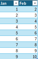
Not much to explain here. Just some simple numbers we've pulled out of the air. To start with, let's ask Copilot to add a totals column to this.
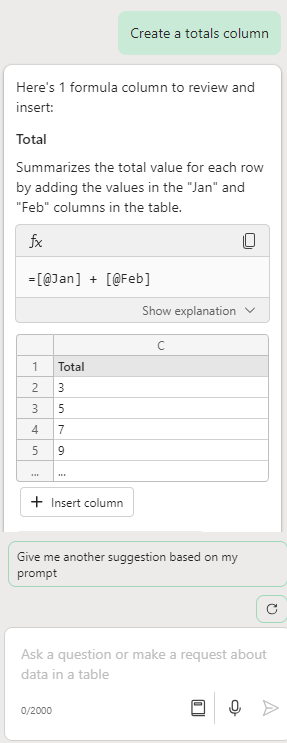
That looks about right. Hit "Insert column" and it will add it to the table for you. Let's try something a bit trickier now. We're going to ask it to add a column showing the percentage difference between the January Figures and the February figures.
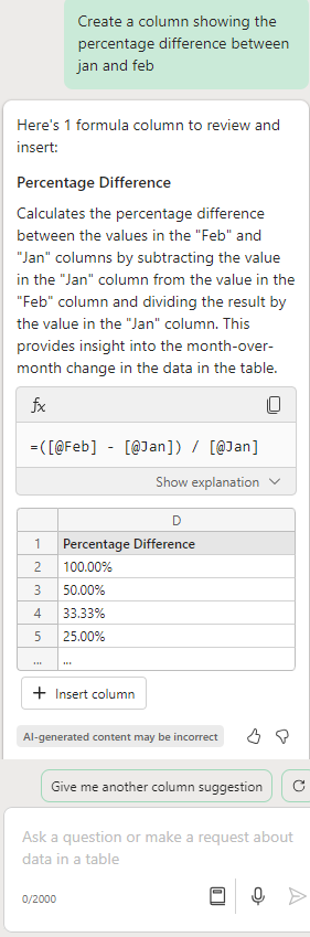
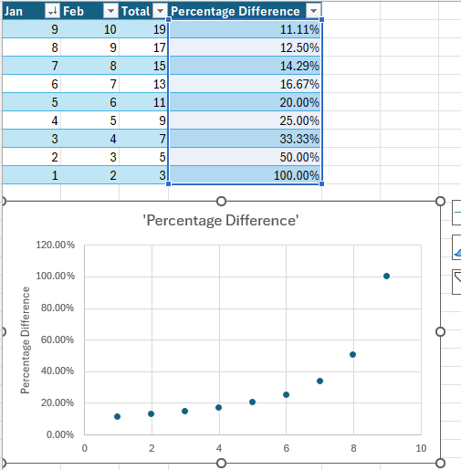
Let's insert that. Now we have that data, let's see if it can turn that into a chart for us.

Copilot has chosen a scatter chart to best represent that data as we didn't specify what type of chart we would prefer. If you know exactly what type of chart you want, you can add this to your request.
Finally, let's get it to resort the table from the highest to the lowest values for the January column.
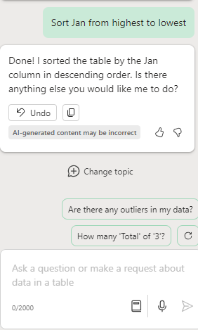
OK - let's have a look at the data now!
It's worth noting that these new calculated columns and charts are all properly linked to the source data. Let's try changing a value at random
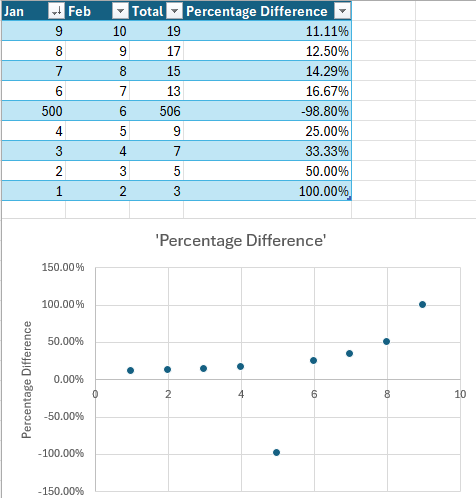
As you can see, changing a value on one of the rows has changed the relevant Total and Percentage Value row, and has also changed the graph.
Hopefully, this has provided an idea of the current scope. We have used very basic examples here so that it's clear what's going on. More advanced users may be interested in its ability to model (eg "Model how a change to X would change Y", assist in creating complex formulae and write VBA to automate some tasks.